
CLIENT
Pearson
MY ROLE
Product Design (UI & UX)
Product Strategy
COMPANY SUMMARY
Pearson is a global learning company dedicated to helping individuals, enterprises, and economies build the skills needed to thrive in a rapidly changing world. This project was created for Pearson’s Enterprise Learning and Skills (ELS) business unit, which helps employers understand labour market dynamics, future-proof their workforces at scale, and support workers in gaining the skills they need. They need a product experience that makes complex workforce and skills data more accessible, usable, and valuable for enterprise audiences.
Problem Statement
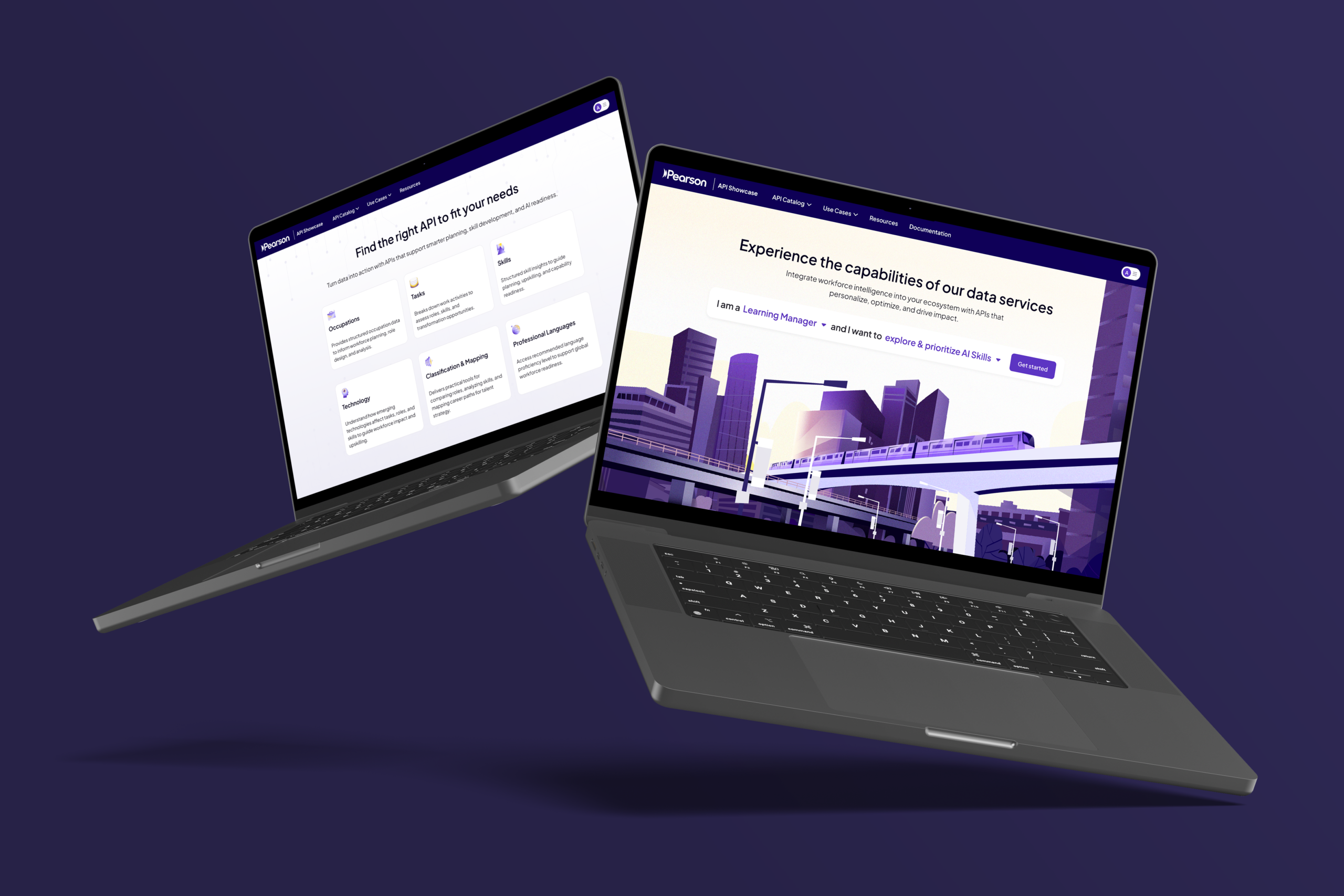
Pearson ELS shifted from a Software-as-a-Service (SaaS) model to a Data-as-a-Service (DaaS) approach, introducing APIs as a new way to deliver its workforce intelligence and AI-driven data models. While this created a more flexible offering for enterprise clients, it also made the product feel too technical and abstract for many intended users. Both customers and internal sales teams struggled to understand the value of the APIs, and the large catalogue made it difficult to know where to start. Rather than supporting discovery, the complexity of the offering often created confusion and friction, making it harder for users to connect the APIs to real business needs and outcomes.
Personas
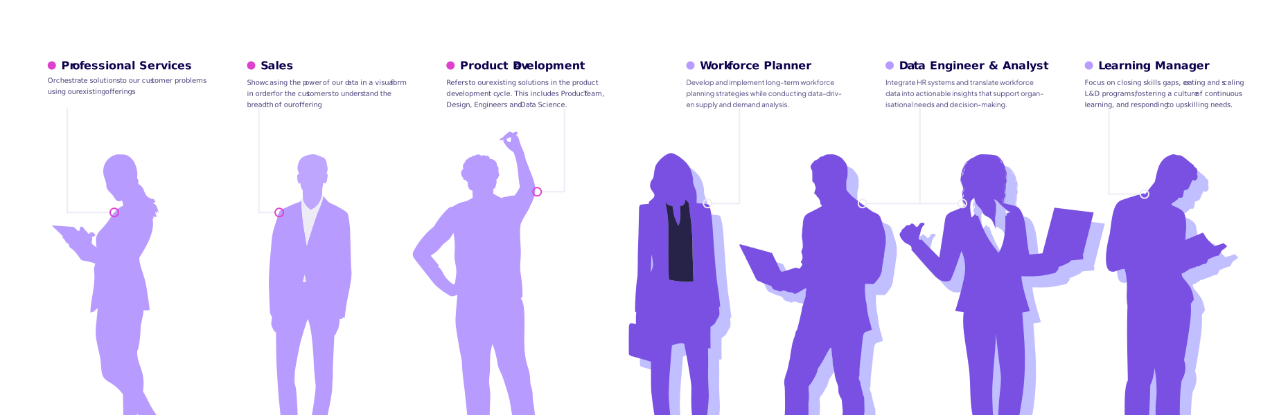
We identified both internal and external personas to shape the direction of API Showcase, recognising that the product needed to support not only potential customers exploring the APIs, but also internal teams using it to communicate and deliver value.
Internal User Personas
The immediate audience for API Showcase was our internal team, as the product needed to function first as a sales and internal enablement tool for communicating the value of Pearson’s data more effectively.
External User Personas
The external personas represented the potential end users of the API offering, each with different goals, levels of technical confidence, and ways of applying workforce data.
User Journey
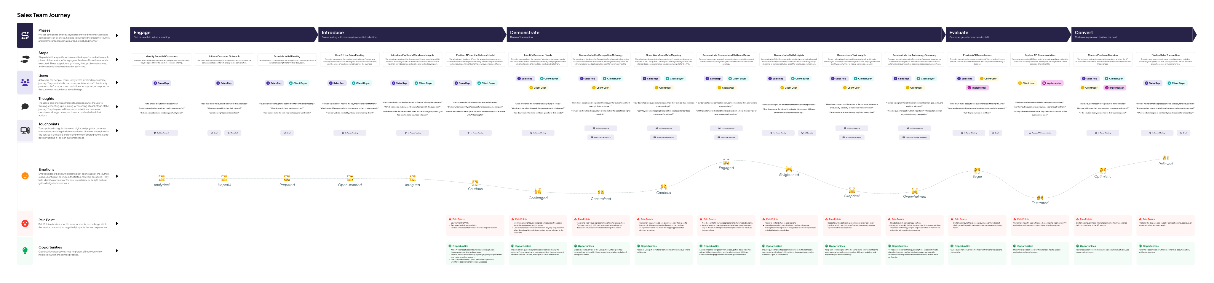
The Sales Team User Journey maps the sales process from identifying customer needs to demoing APIs, supporting evaluation, and closing the deal. It highlights demo pain points such as reliance on experienced sales knowledge, tool switching, limited ontology visualisation, and code-heavy API documentation, helping identify opportunities to make the experience more guided, visual, and easier to understand.
Key Pain Points
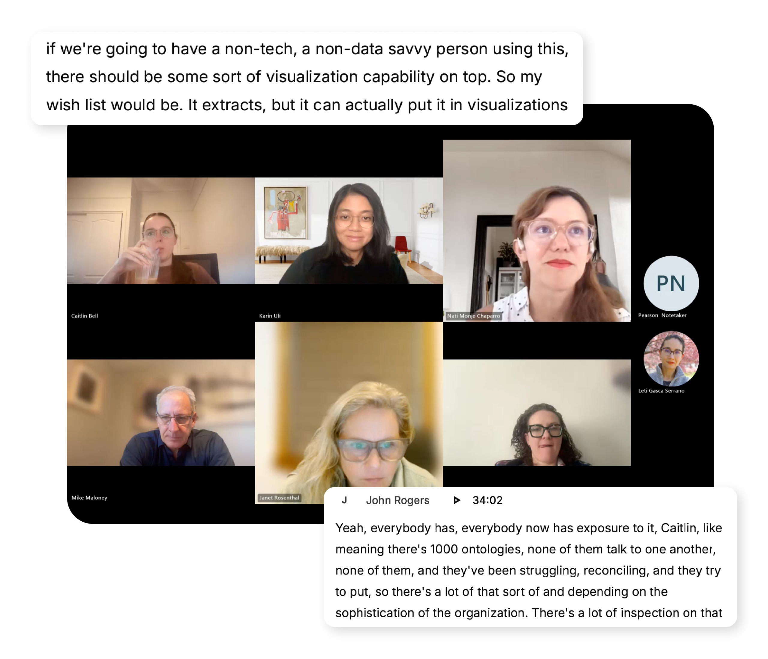
Through discovery, three recurring pain points became clear and helped define the focus of the project. These issues highlighted where users were experiencing the most friction when trying to understand, explore, and communicate the value of the API offering.
Navigation Difficulties
The API offering was difficult to navigate, especially for users unfamiliar with the structure of the product set. Reliance on ontology codes, a long list of APIs, and weak connections between individual endpoints made it hard for users to know where to start or how to move through the ecosystem with confidence.
Lack of Use Cases
Users struggled to quickly connect the APIs to real business problems and outcomes. Without clear examples, flows, or practical starting points, the offering often felt too abstract, making it harder for both customers and internal teams to understand what was possible and why it mattered.
Visualisations & Explanations
For less data-savvy audiences, raw API outputs alone were not enough to communicate value. Users needed clearer visualisations and supporting explanations to help them interpret the data, understand the insights, and grasp the broader story behind the results.
How might we make Pearson’s API offering easier for internal teams and customers to navigate, understand, and apply to real business needs?

"How Might We" framework derived from the user research synthesis
Curveball: Designing Through a Brand Shift
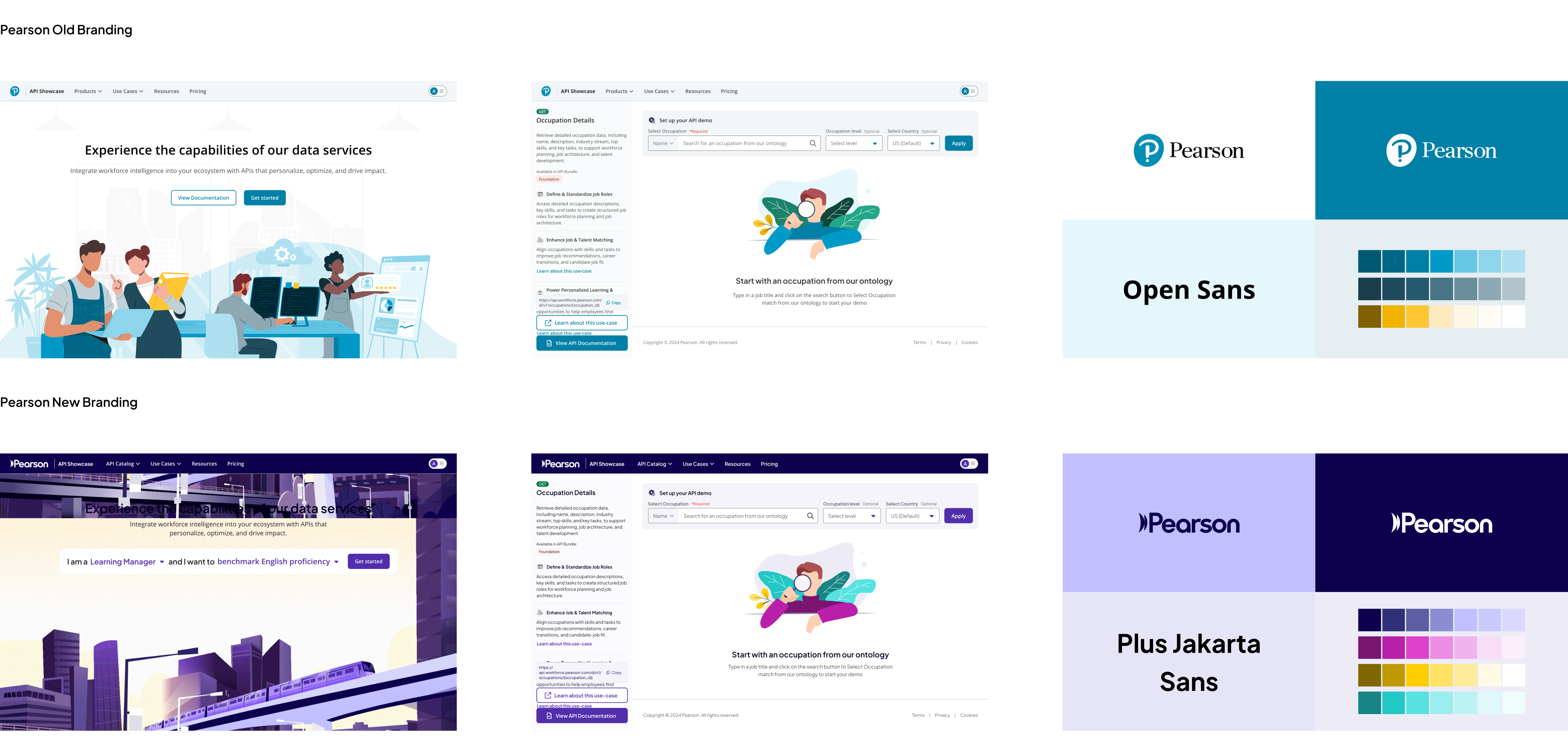
At the start of the HiFi design phase, Pearson Headquarters introduced a new branding mandate that needed to be applied across all product experiences. This meant the designs I had already started needed to shift quickly, including updates to colours, typography, illustrations, pictograms, and the overall visual graphic style.
Instead of treating the change as a setback, I used it as an opportunity to refine the interface and strengthen brand consistency. The result was a design direction that still supported the product goals while feeling more polished, scalable, and implementation-ready.
DESIGN SYSTEM EXPANSION
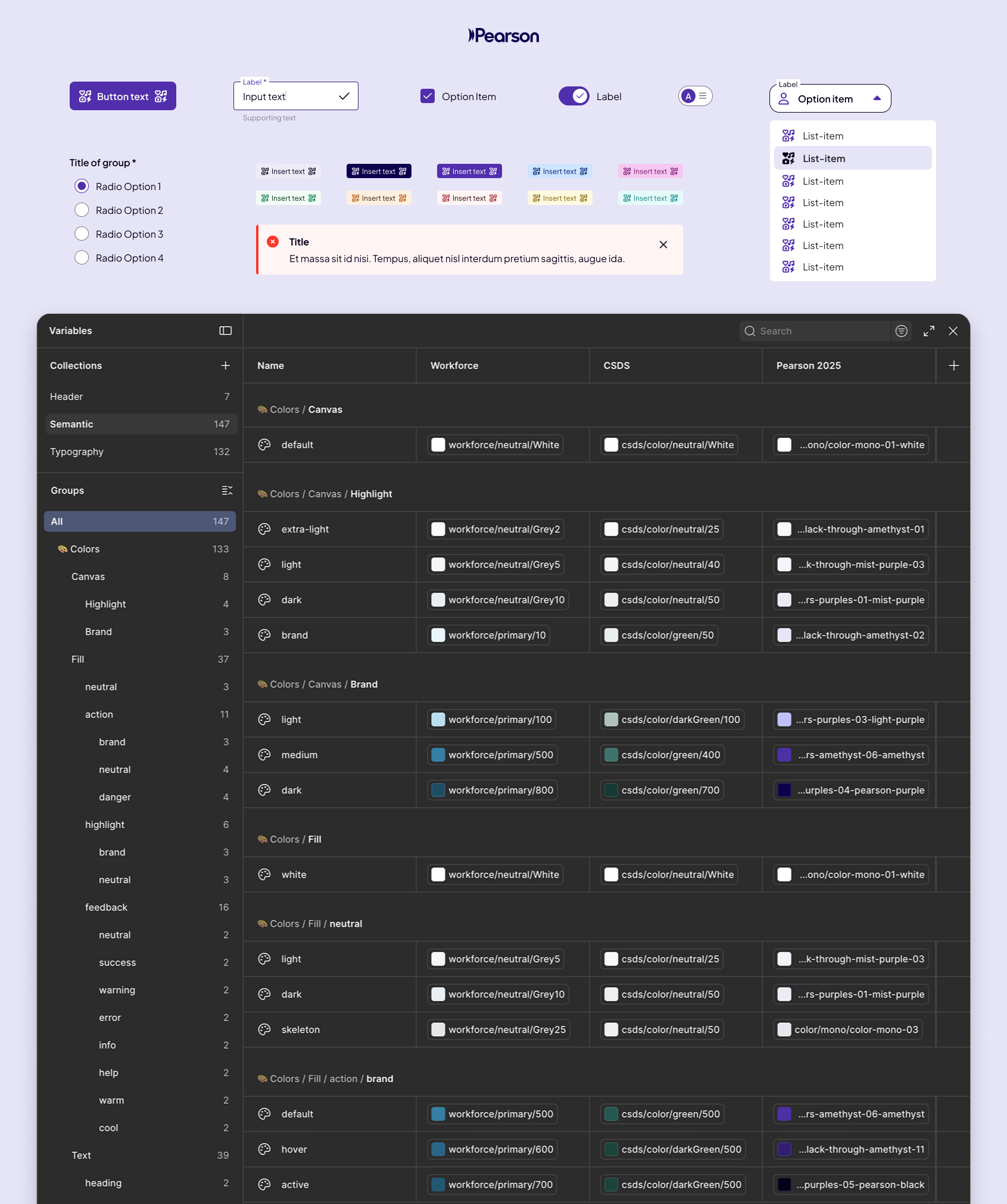
I led the initiative to integrate Pearson’s new branding into the existing dual-branded Pearson ELS design system, while still preserving Credly’s brand requirements as a sister company. To manage this complexity, I used a semantic theming system in Figma, allowing colours, typography, and illustration styles to adapt across brand modes without fragmenting the core design foundation.

Introducing API Showcase
To address this challenge, we created API Showcase: a new platform for exploring, demoing, and evaluating Pearson’s APIs in one place. This solution makes the API offering easier for internal teams and customers to navigate, understand, and apply to real business needs through guided inputs, interactive outputs, and recommended flows based on business goals. The result is a more visual, intuitive, and collaborative experience that helps users engage with Pearson’s APIs with greater clarity and confidence.
PERSONALISED API DISCOVERY
Find a Solution was created to help users navigate the sea of APIs more easily by giving them a clearer place to start. After clicking Get Started on the homepage, users are guided through a simple selection flow based on their role and goal.
From there, API Showcase presents Best-Fit APIs tailored to their chosen objective, alongside Other Recommended APIs that may still be valuable to their day-to-day work based on their persona. This made discovery feel more intentional, relevant, and far less overwhelming.

Navigation Structure Cleanup
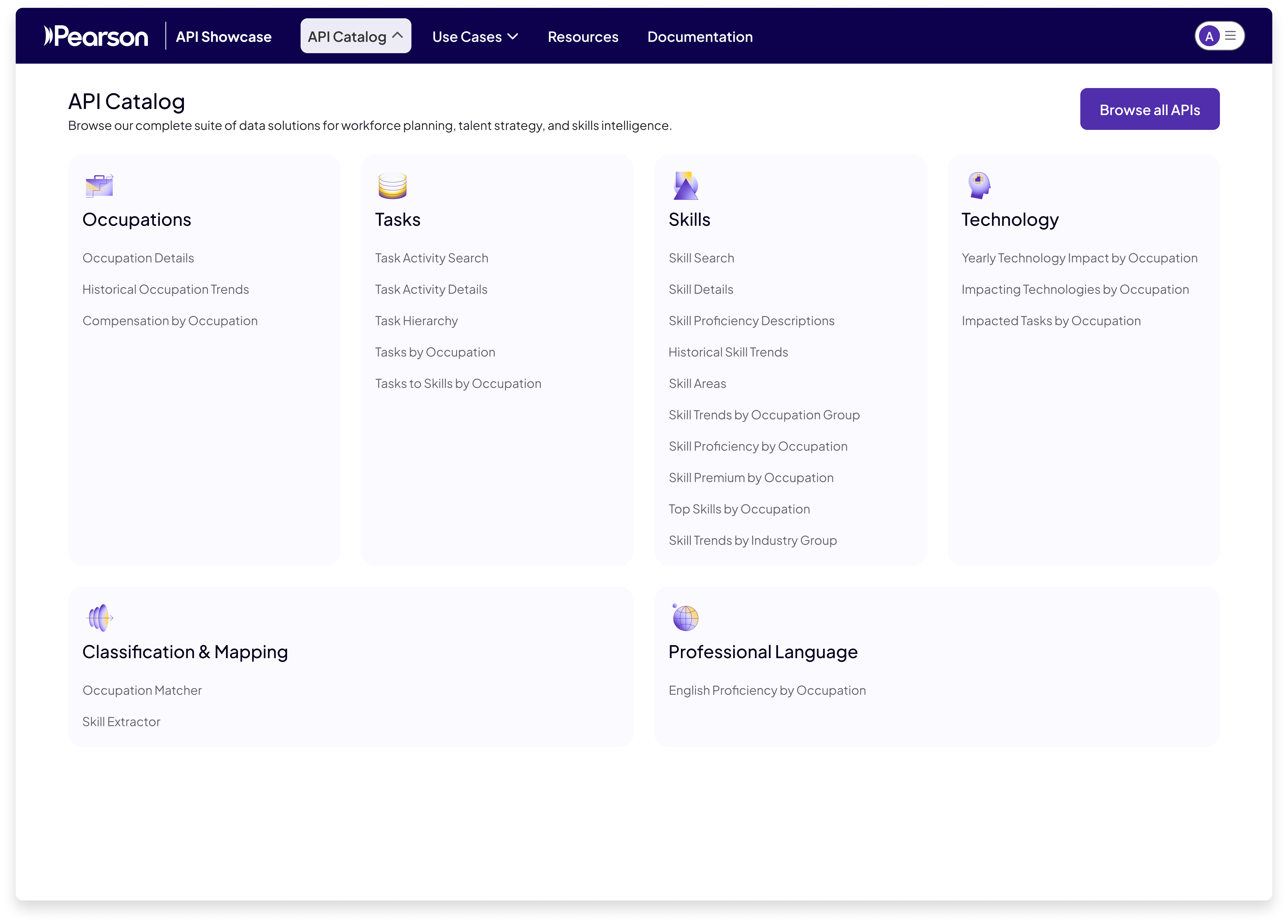
Research showed that the long list of APIs was overwhelming for both new users who did not know where to start and existing users who struggled to locate the right endpoint quickly. To improve findability, I reorganised the API catalogue into clearer groups and shifted the experience from a side navigation model to a top navigation with full-page dropdowns that were easier to scan and browse. The key change was moving away from grouping APIs by input type, which had led to unintuitive categories, and instead organising them by the nature of the insight they provide. This created a structure that felt more natural to users and better reflected how they think about the offering.

Simpler Search
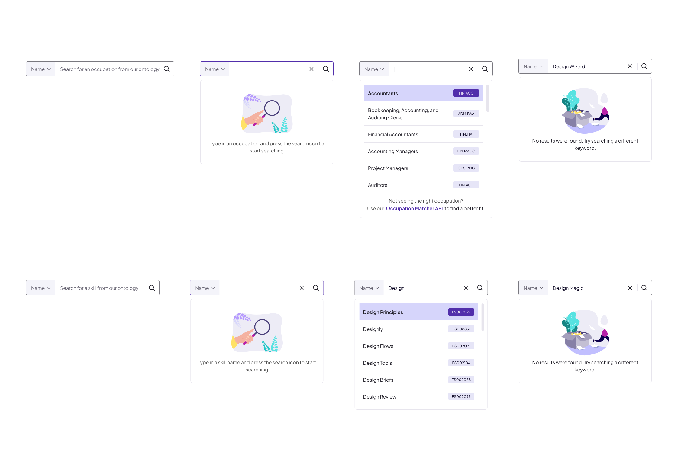
A major pain point in the previous experience was the reliance on ontology codes, which forced users to leave their flow to look up skill or occupation IDs before using an API. To make this more intuitive, I introduced in-page search on each API page so users could look up skills and occupations directly where they were working. The search also included a toggle between name and code, supporting both more user-friendly exploration and code-based workflows.
REDUCING REPETITIVE EXPERIENCE
Users often had to repeat the same navigation and setup steps across separate API pages just to explore related insights, making the experience feel fragmented and inefficient. To address this, I introduced grouped API views that brought similar or commonly paired APIs into one place, allowing users to switch between related insights more easily.
In this example, Trending, Emerging, and Declining Skills by Occupation were combined with Historical Skill Trends by Occupation to create a more connected view of skill movement over time. The left panel shows which APIs are contributing to the experience, while standalone APIs still retain dedicated pages supported by use case guidance.

GUIDED NEXT STEPS
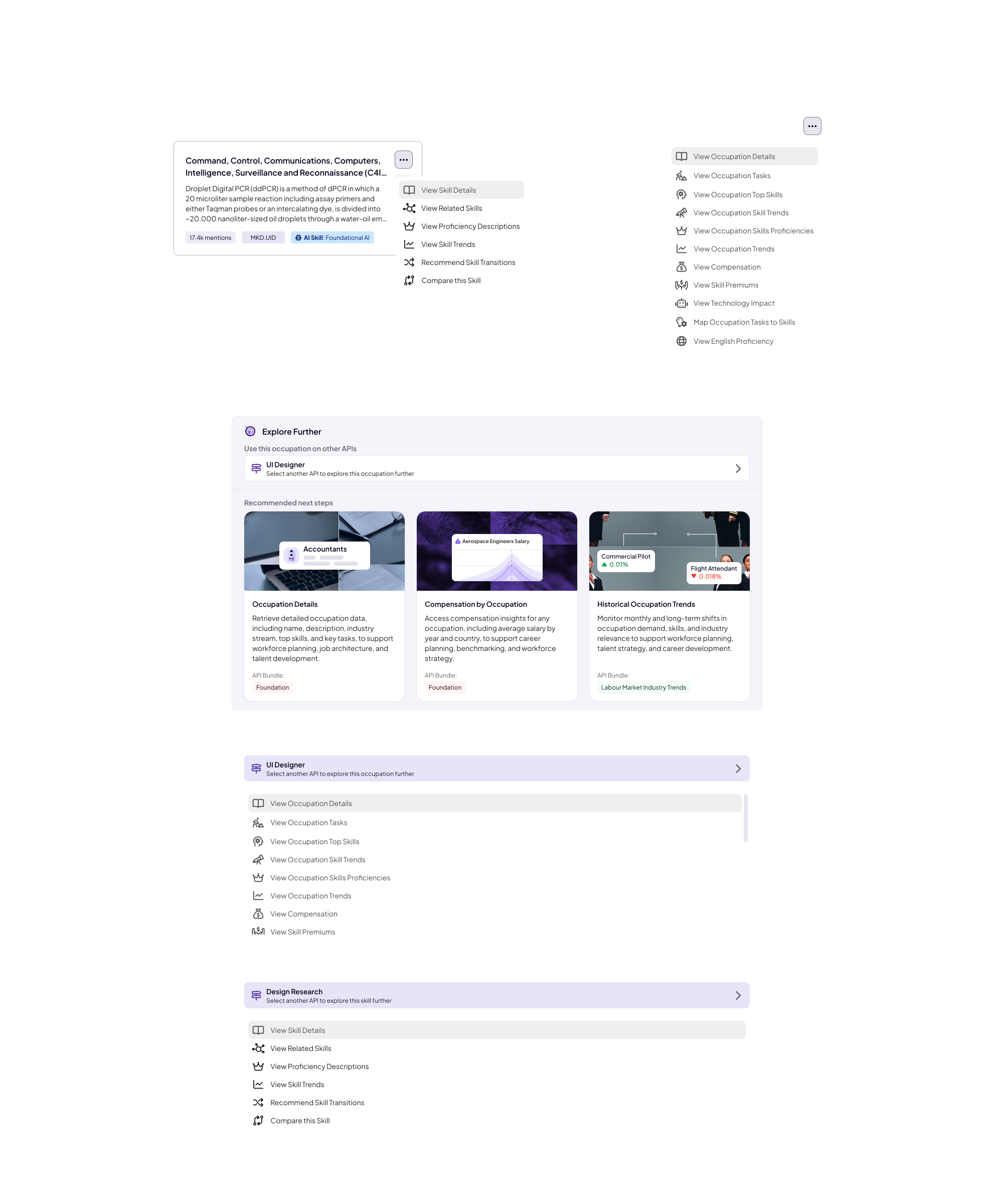
To support guided exploration, I introduced an Explore Further feature that helps users move between relevant APIs without losing the skill or occupation they are already working with. Building on a behaviour that users already found valuable, the ellipses menu on each result card allows them to take a specific skill or occupation into another compatible endpoint, making exploration faster and more seamless.
This was paired with a consistent panel at the bottom of every API page that also surfaces Recommended next steps: three APIs that represent a natural progression from the current page. Together, these features reduce friction, encourage deeper discovery, and create a more connected experience across the API ecosystem.
Solution Packaging
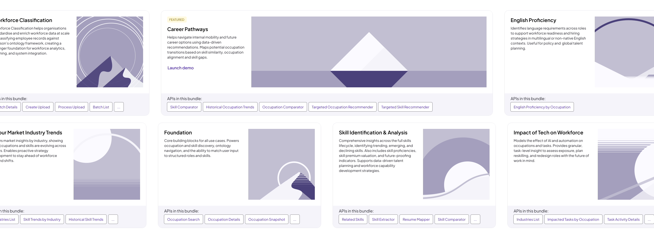
To address the lack of clear use cases around our APIs, we introduced API Bundles: curated sets of endpoints designed around specific customer problems instead of standalone technical products. This made the offering easier to understand, evaluate, and position by shifting the focus from individual APIs to more standardised, solution-oriented packages.
Visualising Value
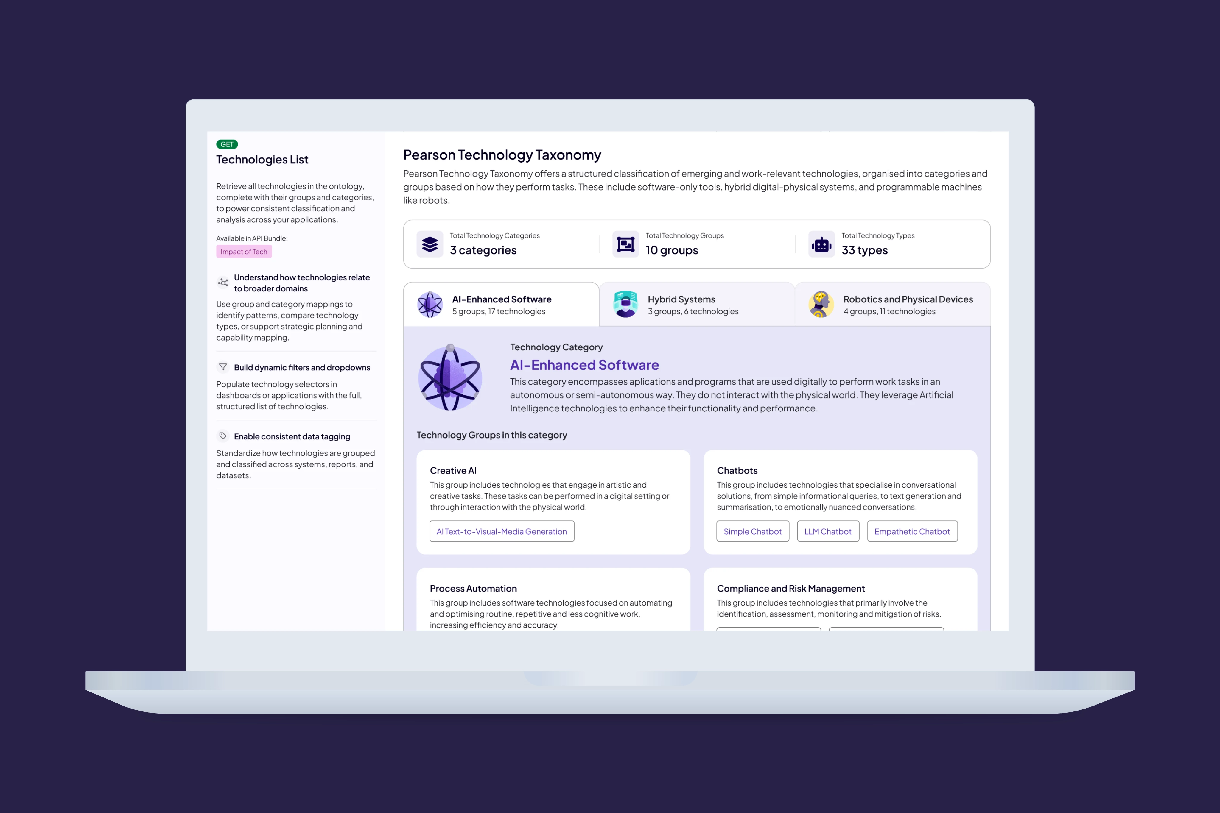
To address the need for clearer visualisations and explanations, I designed API Showcase to present data in a more engaging and accessible way for users with different levels of technical confidence. While richer visual outputs helped make the value of the APIs easier to understand and more compelling in customer conversations, the experience also supported more technical users through alternative formats such as table view and downloadable outputs.
NEXT PROJECT
Faethm Service Design